Thursday, September 24, 2015

Halloween Lenticular Portraits

The Halloween Decoration Extravaganza is ongoing at my apartment!!!  Today I am going to share three lovely lenticular portraits that I bought from the Dollar Tree.  If you aren't familiar already lenticular pictures change depending on what angle you are looking at them from.  I've loved these for years and there are some great ones online - old timey photos that transform into creepy creatures of the night right before your eyes.  Most of them range anywhere from $30 to $50 are way more than I want to spend for decor that is only up for a couple of months at most.  But within the last few years I have seen some cheaper lenticular pictures at Walmart and some dollar stores.  I have two smaller 5x7 black and white ones in my Halloween collection.
Needless to say I was super excited when I found these three pictures at the Dollar Tree.  They are quite large - at about 12x16 each.  The ornate frames are part of the picture itself - the entire thing is flat, there is no real frame.  I forgot to take a picture before I cut and framed my portraits so I included this picture from the Dollar Tree's website.  

These are actually really pretty and colorful and nicer than even some of the ones I have seen online so I was really surprised!  I also find it interesting that I hung mine in the exact order as the online picture even before I had seen it!
 I wanted to try and show a before (normal) and after (ghoulish) shot for each of them, but it was hard with a camera so these aren't the greatest pictures.  This is picture #1.
Picture #2.
 Picture #3.

As you can see I cut the portraits themselves out.  I wanted a real frame and I wanted something that looked a bit old fashioned, but I didn't want to spend very much since they were just for decoration.  I looked through the frames at the Dollar Tree hoping to find something silver, but all I could find were black 8x10 frames.  When I had almost given up I came across a box of frames that were this bronzish (sp?) sort of rust color and I thought they would work perfect for an antique looking frame.  I used the example picture inside the frame as a template to cut down the portraits and then I added a piece of cardstock cut to look like matboard just to add another touch of realism.  The cuts aren't perfect, but I don't really care - I still love the way they look - even with the awful 70's carpet lining the walls in my downstairs hallway!
And here is picture #1 from a different angle.  You can see my staircase in the reflection as well.
 And picture #2 again.  This one is probably my favorite :)
#3.  I didn't quite get the right angle on this one, she looks a bit more creepy if you stand just a bit farther to the side, but at least you get the general idea.
The above photo is looking from the landing down at my three portraits.  I'm trying to hang some spider web as you can see :)
 
Total cost for this project was $6, $3 for the lenticular portraits and $3 for the frames.  I already had the cardstock at home that I used for the matboard, but if you don't have any you could always use a regular sheet of printer paper.

I can't wait for Halloween!

DIY Decoupage Halloween Napkins as Bottle Labels


 My favorite time of year is almost upon us so I decided today that I should start decorating for Halloween.  I had David drag my Tupperware full of decorations upstairs and I also took a trip to Michael's and the Dollar Tree for decor.  I visited Hobby Lobby as well, but they are already so full of Christmas stuff that I completely got distracted and bought two lovely winter candles, but that's beside the point.  

The Styrofoam skull came from Michael's.  The painted ones like this were $7.99 with 40% off while the plain white ones were $7.99 with 20% off???  I want to use it for a craft project that I saw on Michael's ideas page, but that will be a later post.
Anyway for today's project I decided to put some of my amber vials from the pharmacy to good use.  These are two of the larger bottles and they have huge labels on them that have to be removed first.  At some point when I remember I'll do a post showing how I remove sticky labels as I have so many bottle crafts I am doing this almost daily sometimes.  I thought the amber vials would give a nice color and would also make a nice vintage looking bottle, which is what I wanted for my Halloween decor.

If you don't have amber glass then you could use an empty clear glass bottle from your fridge or even a nice wine bottle would work, which is what I want to try next!
  
You will also need Mod Podge and a paint brush.  If you don't have Mod Podge there are plenty of pins on Pinterest about making your own using equal parts white school glue and water.  Some say to use less water than glue as school glue seems to be pretty watered down as is.  The Dollar Tree has white glue two bottles for $1 in the stationary aisle.
 These adorable napkins came from the Dollar Tree as well.  There are maybe 10 napkins to a pack.  I liked these because they were double sided so I could get 2 different labels out of each napkin.  You'll need to unfold your napkin so that you can see all 4 squares.  These are sort of like 2-ply toilet paper so you'll need to peel the 2 sheets apart as you only need the printed sheet for this project.

These napkins are the larger size so they took up the entire front and sides of my amber vials (this is one reason why I think I'll try this project with wine bottles next!).  I cut away the black border and left the inner brown and green borders for each label. 

Next I took my paint brush and applied Mod Podge to all 3 sides and also let it run over a bit at the top and bottom of the bottle.  I then centered my napkin and folded the excess around the bottle.  I smoothed out any big bubbles, but smaller wrinkles actually add to the effect of an old looking label.  I let it dry for a minute or two and then used my paint brush to add another thin layer of Mod Podge on top of the napkin.  I tore a couple of tiny holes in the napkins when I was doing this, but once again it just added to the effect.  The second coat also helps to ensure that the edges of the label adhere to the bottle.

Afterwards I sat the bottles aside and let them dry completely.  Any excess Mod Podge is easily wiped off with a damp rag.
Here is bottle #1 Graveyard Dust - see, doesn't that make a perfect Halloween label?!  And I just love the tombstone as well :)
  
And bottle #2 - Witches' Brew/Screech's Wing Potion.  I especially like that the bottom of this napkin said "DO NOT SHAKE BOTTLE"!!!
This picture is a little off because of the flash (the first picture in this post is as well) - the colors are not this bright, but at least you can see the detail of the wrinkles from the napkins here.  I hope everyone enjoyed this project and if anyone tries it out or finds some really awesome Halloween napkins at another store please share!

Sunday, May 3, 2015

Scrapbook Sunday!

I haven't worked on my scrapbook in forever - and I mean FOREVER.  This is one of the most recent things that I've worked on - my first trip to Bonnaroo in 2007.  I would say that puts me about 8 years behind, but I know that my trip to Mardi Gras was before hurricane Katrina so that means there are pre-2005 pics and beads somewhere that need to be commemorated in scrapbook form :)

I'm not a scrapbook professional by any means - my stuff is all a little weird and probably won't appeal to anyone other than me, but I still enjoy the times when I find a way to pull it all together.  I keep just about everything, including things that most people would probably just toss out and store them away in my filing cabinet until I find a use for them.  I've had alot more time on my hands since passing the NCLEX so I've decided to pull everything out and start sorting it all so I can sort of plan future scrapbook pages.

As a scrapbook novice I've found that if I separate things into "categories" then I don't get frustrated so easily.  Right now I have 3 categories -

1.  The Background - the 12x12 piece of paper itself or some other large element that helps to tie the entire page together
2.  The Subject - for me this is usually pictures, ticket stubs, or just something physical from the date/time/event that I'm scrapping about
3.  The embellishments - anything decorative, lettering, stickers, etc.

I've been searching for scrapbook inspiration on Pinterest lately and on other blogs like my friend Emily's http://mrscraftyadams.blogspot.com/.  She makes these smash books that are some of the most beautiful and organized memory albums that I have seen! :)


Another thing that I've noticed is that scrapbook pages seem to flow better in pairs.  So above would be page 1 of 2.  A music magazine came in the mail not too long after our trip and two of the pages were about the festival and featured the very prominent black and white fountain that is in Centeroo.  So I chose a black background to balance out all of the white in the pages.  I probably could have used scissors to trim the edge of the pages nicely, but I think I prefer the torn out look.  My subject here would be the two crowd pictures in the corners and one of the leftover iTunes cards that came with our tickets that year.  The frame that I used for the picture in the upper right hand corner actually came out of junk mail that we received from Camel cigarettes.  What was left after the perforated coupon was punched out looked just like a frame to me so I stored it away just in case!  What I call embellishments would probably be where I spelled out the event and year with stickers and the pieces that I cut out of the Bonnaroo guide about specific bands or entertainers that we saw.


And this would be page 2 of 2.  I included the bios for other bands that we saw and the sparkly red wristband for color.


This piece is probably one of my favorites :)  If you didn't think I was odd already then you probably will after I explain.  This was another piece of junk mail from Camel.  The two center squares were actually pictures of cigarette boxes.  I cut them out and used them as frames to show off David's friend's Bonnaroo haircut ;)


(Btw, you can click any of the pics to make them open larger in another tab.)


Pages 3 and 4 are kind of a hodgepodge of more band bios, some statistics about the festival that I cut out of the music magazine and my shiny silver ticket stub.  The piece behind the pic of David sunbathing is cut out from a cardboard 6-pack beer holder.  And behind the pic of David's temporary tattoo (it actually ended up being more permanent than he expected because he ended up with tan lines in the exact shape!) is a cut out of the names of bands who played at the festival.  I may go back and change this because I'd like to be able to fold the picture up to show all of the names beneath.


Half of the pictures that we took that year were with a black and white throw away camera.  This impromptu photo of me came out kind of nicely (especially with the random hippie in the background) so I used another piece of the silver Coors 6 pack holder to match the picture and the tiny pop of red to match the background.


I don't love pages 5 and 6 so much, but they'll do for now.  I'm not sure exactly why I picked blue other than maybe it matched the Flight of the Concords cut out.  I also used three more camel coupon cut-outs as frames.


Me and Swabby.


David and I <3 p="">

The Bonaroo arch.  Between the arch and the main stage is basically enough room to fit all 80,000 attendees.


I adore maps.  I keep them from every place that we visit so Bonnaroo was no different.  I used the map of the festival grounds as my background and layered everything else on top for this page.


And this is another one of my "fancy" (lol) 6-pack frame cut-outs illustrating David, Swabby, and Nick as the drinking team ;)

Happy Sunday blogland!

Thursday, April 9, 2015

Country Cottage Update


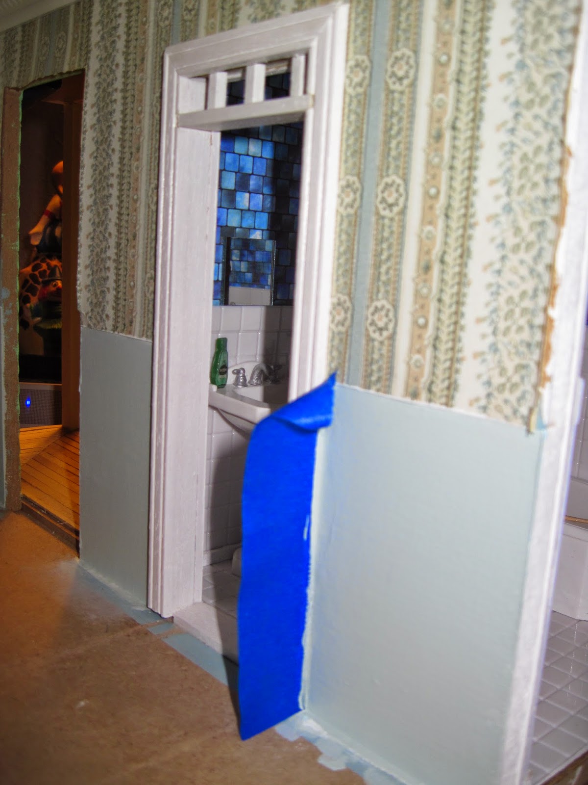
I decided to pull the Country Cottage kit out again and do some more work on the bathroom addition.  If you remember from earlier posts I expanded the kit so I could add a bathroom.  I added walls out to the edge of the porch, but the bathroom was still so tiny.  So I made my own sort of base that was as tall as the porch and then added walls and siding.  It has been sitting and gathering dust for months while I was in school so I decided to finally paint it to match the rest of the house.

Next I'll probably try staining the porch and finished painting all of the trim white.


The modern bathroom that I bought fits perfectly and I wanted to see what how my bathroom accessories looked as well.  I haven't glued anything down yet so I just used glue dots to place the towel bars, toilet paper holder, and soap dish (which you can barely see on the tile over the tub).  I don't have a finished medicine cabinet yet so I propped up a mirror on the tile for the picture.  In the above scene maybe the cottage's future inhabitant is just moving in and is stocking up supplies.  She has no shower curtain or towels yet!  I think the coupon minis look so cute though!!!  I also love the tiny toothbrush in the plastic tumbler on the sink.  I will have to look for some bathroom rugs though - there is just so much white!  Or maybe once I have a shower curtain it will help as well.  Now I just have to figure out how to make one...


I also decided to repaint the bottom walls in the living area.  I liked the blue, but it didn't match the blue in the wallpaper as much I would have liked it to.  So I took a piece of the wallpaper to Michael's and matched it up with Martha Stewart's Cloud satin paint.  I like the new blue tone much better and I can't wait to find a pretty patterned piece of wood to make a chair rail out of.  And of course I'll also need to add a border around the bottom.

Next I'll probably start working on my kitchen cabinets again.  I'd like to get them hung so I can see just how much space I really have to start decorating with :)

Thursday, April 2, 2015

Spaghetti dispenser

The other day at the pharmacy one of my coworkers who was working production found an odd sized desiccant that I had never seen before.  I can't remember what drug this was in - maybe the Topiramate 50 or maybe not because those bottles seem really small (I'll pay more attention next time).  I loved the tall cylindrical shape and figured I could find some use for it.

When I worked at the mall (a thousand years ago - my first job!) we had this lovely glass straw dispenser.  You pulled the lid up and all of the straws kind of spun out of the top.  It was very pretty with a shiny chrome lid and for some reason I just loved it.  I've always wanted one myself (not that I need that many straws) and I thought another use for it might be a pretty way to display spaghetti noodles on the kitchen counter.  We eat spaghetti almost once a week around here, it's cheap and fast - perfect for our budget and easy after a long shift at work.


So I went to work digging through my beads and jewelry findings to make the inner workings of a mini straw/noodle dispenser.  I took two small round burnished silver filigrees and  used my needle nosed pliers to bend the edges around the top and bottom of an unopened desiccant to make the base and the lid.  To make a little handle on the lid I added a silver daisy spacer.

And for the inside I cut a piece of silver jewelry wire (sorry I don't remember the gauge) and glued the top of the wire to my lid and added a drop of glue into the daisy spacer.  For the bottom piece that the straws/noodles sit in I used a small silver filigree bead cap that I smashed flat with my pliers.  I then added another daisy bead to make it a little more sturdy and also to have another space to add glue for extra support.


Here is my finished product.  After you cut a hole in the top of the desiccant to empty the insides it makes it easier to get your scissors down in there to cut the tube down to the height that you want.  Its a little wider than a real straw dispenser would be, but in a mini scene I don't think anyone will notice.  The spacers helped to hold the glue so that everything moves perfectly when you pull the lid off.


I don't have any mini spaghetti so I just grabbed a real noodle out of the cabinet and snipped it into mini pieces.  A real spaghetti noodle is about 10 inches long, but mine are probably closer to 8 or 9 scaled inches because I cut my dispenser a bit shorter to try and approximate the size.  I guess I could roll out some really thin yellow clay and make more realistic mini looking spaghetti, but that will have to be for another day.


And voila!  We're ready for a mini spaghetti feast!


And this is just a bonus pic, but I wanted to share how cute my noodle dispenser looked next to my mini colander.  This is one of my favorite pieces ever and it was handmade by Lori - you can find her etsy shop at 
I may go back and make a couple more of these - especially if I can find a tutorial for making 1:12 scale straws!  And of course the metal findings could always be painted to match whatever color is in the mini kitchen where they will be displayed :)

Happy Thursday blogland!

Monday, March 23, 2015

A place for all the pretty things!

I've had this typeset tray for years upon years.  My Aunt bought it for me from an antique shop in upstate New York during a family vacation long ago.  I've always thought it was lovely and wanted to do something with it.  There are lots of inspiring projects on Pinterest for typeset trays so I decided to give it a try with mine.  I saw some trays turned into tables with glass over the top to display small collections.  I also saw wine corks glued inside of the tiny cubbies so the board could be used to hang notes with stick pins.  The use I liked the most was as a jewelry display.


So I dusted my tray off and bought some eyelet screws and went to work.  I recently bought a Black & Decker drill (so I wouldn't have to borrow my Dad's so much!) and also a set of drill bits.  The drill makes it really easy to make the right size holes, but since you can't use a screwdriver for eyelet screws the rest had to be done by hand.  My hands are very sore at the moment so I've only added enough screws to hang 20 or so pieces so far.  Some of the trays that I saw on pintereset were painted bright colors and others were made to look kind of worn or shabby chic, but I really like the natural color of the wood so I decided to leave it as is.

Below are a few pics of some of the earrings that I've hung so far.  I really don't have a whole lot of jewelry to start with, but now I guess I'll have plenty of room to add more in the future.  I haven't figured out yet how to hang all of my stud earrings or all of the hoops that I have that won't fit in an eyelet screw.  I'm thinking maybe ribbon would work for the studs, but I haven't tried that yet.  I don't have any "real" jewelry, it's all just pieces that I thought were pretty and have bought from department stores, online, or ones that I received as gifts - nothing fancy, but I think they look so pretty displayed!


I used large screw eyes (I think that is what they are called?) along the bottom to hang necklaces.  I only put one every other space so more could be added later - plus more than one necklace could be hung per hook.


Bracelets were another thing that I wasn't sure how to hang.  I found lots of pins for jewelry displays on pinterest and this was another idea that kept showing up.  Lots of people have used pretty bottles and just draped their bracelets over the neck of the bottle.  I didn't have any pretty bottles, but I do love the strap locks that are on these Grolsch beer bottles and I wasn't using them for anything else so I decided they might look nice sitting in front of the typeset tray :)


So anyway, there's my new jewelry display!  I think I really it so far.  And maybe I'll remember to wear my jewelry on occasion now that its all out where I can see it!

Saturday, March 21, 2015

Catch-up posts: Group Painting


The pics I'm posting here are actually from 03/21/15 according to my phone so I'm adjusting the blog date to reflect that as well. It's just a fun little series of shots from my first group painting session :)  These were taken at Masterpiece Mixers in Johnson City, Tennessee.


Ta-da!